The Storyboard Component in IdeaBoard helps you visually map out sequences of ideas, events, or screens in a structured, frame-by-frame format. It is ideal for planning user flows, product experiences, marketing narratives, presentations, product/demo videos, or creative concepts.
How to Add the Storyboard Component?
In the IdeaBoard editor, click the Add icon in the top-left corner. Search for Storyboard and drag and drop the component onto the canvas.
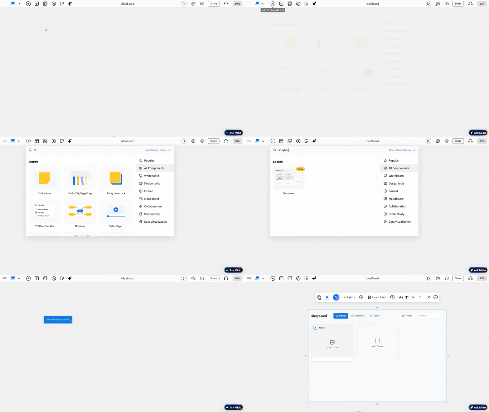
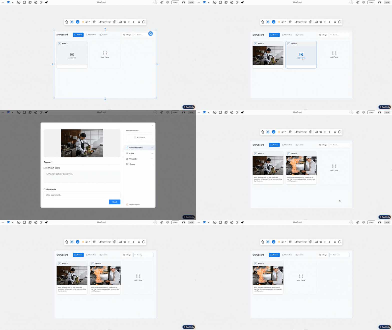
Other options are detailed below in this order:
- Generate Storyboards with AI
- Importing a Script into the Storyboard
- Switch Between Multiple Storyboard Themes
- Enabling Storyboard Settings
- Font Settings in the Storyboard
- Advanced Settings in Storyboard
- Using focus mode in Storyboard
- Sharing the storyboard
Generate Storyboards with AI: By using AI, you can quickly generate the first draft by clicking the 'Gen with AI' icon in the quick toolbar. Enter your prompt, and IdeaBoard will automatically create storyboard frames based on the prompt. You can further edit and refine the content.
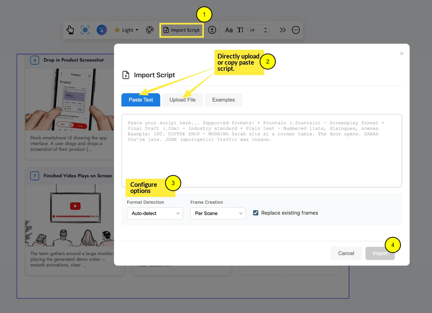
Importing a Script into the Storyboard: If you have your script already, then just click on 'Import Script' from the quick toolbar, and the content will be converted into storyboard frames automatically.
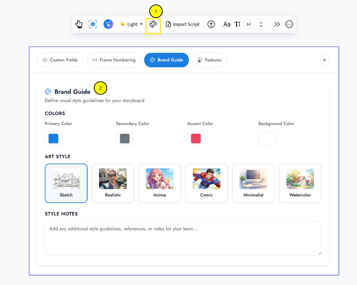
Define the Visual Style of Your Storyboard: Using the 'Brand Guide' in the quick toolbar, you will be able to customize the visual style of the Storyboard. This helps you apply consistent branding, colors, and visual preferences across all frames.
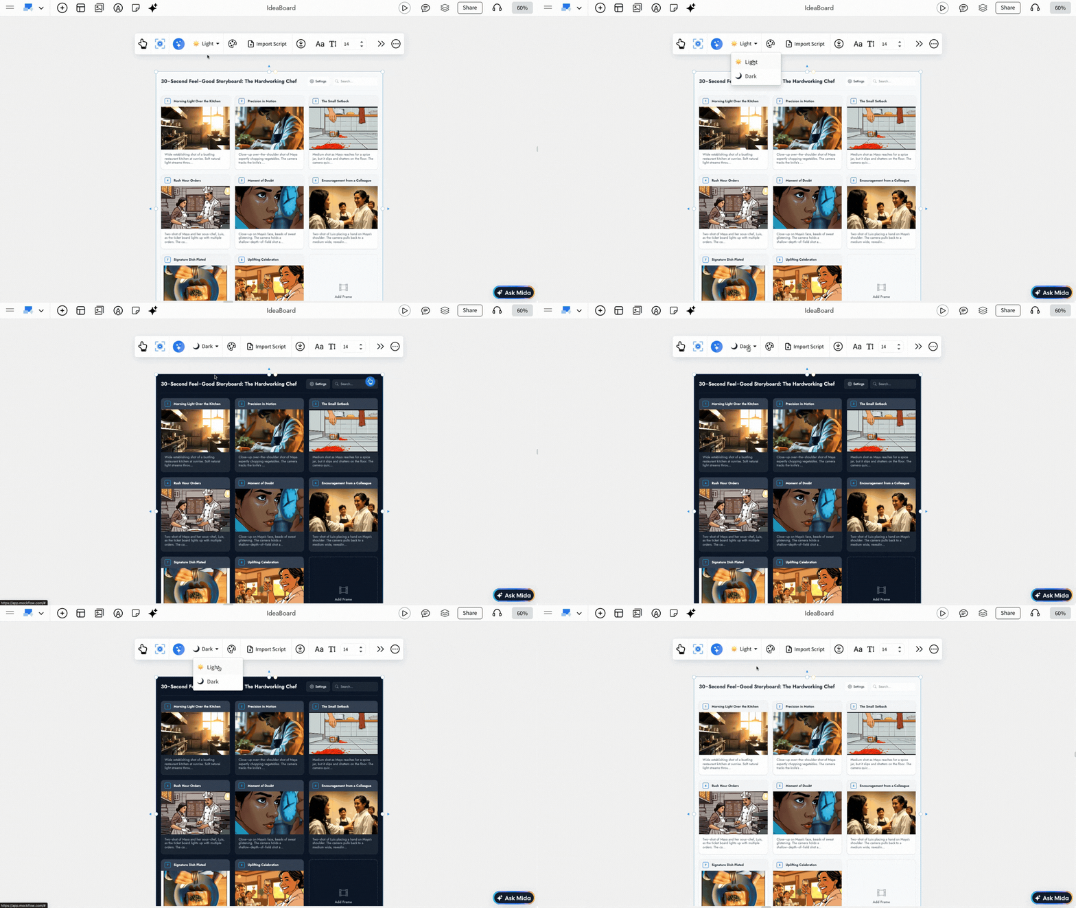
Switch Between light/dark themes: You can switch between light and dark modes from the quick toolbar based on your storyboard content/theme.
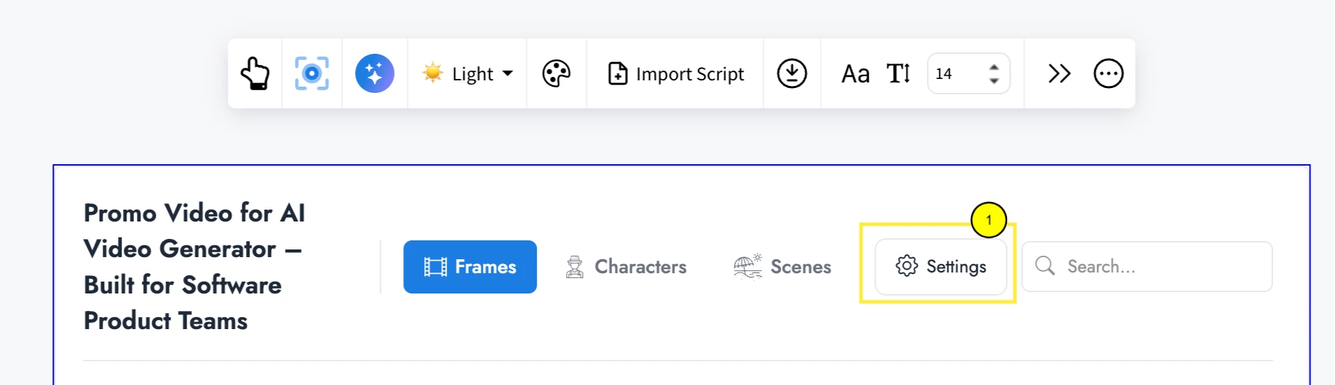
Advanced Settings: Double-click to edit the storyboard and then click on 'Settings' option inside the component - you can access several settings such as Custom Fields, Frame Numbering, Brand Guide, and Features.
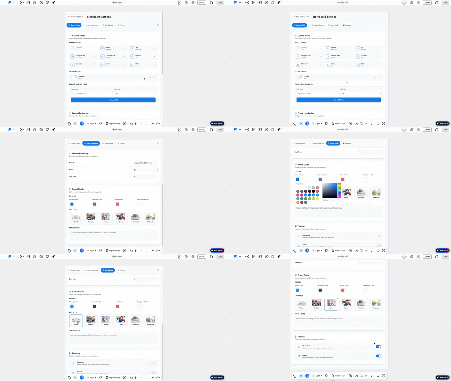
1. Custom Fields
You can manually add the fields necessary for your storyboard.
2. Frame Numbering
You can configure frame numbers for your story, scene by scene.
3. Brand Guide
Make visual changes, such as color and character styles, and add style notes to maintain consistency across the storyboard.
4. Features
You can enable or disable additional features like characters and scenes within the storyboard.
Exporting the Storyboard component: Using the 'Export' option from the quick toolbar, you will be able to download the storyboard in these formats - PDF, CSV, JSON, plain text (.txt), images (.zip), markdown (.md), and fountain file formats.
Using Focus Mode in Storyboard: Focus Mode hides all other components and highlights only the Storyboard component. You can click the 'Enter Focus Mode' icon in the quick toolbar to enable it. To exit Focus Mode, click the Close icon at the top-right corner.
Sharing the storyboard: In Focus Mode, you will find a 'Share' icon at the top-right next to the 'Close' icon. Click the Share icon to copy a unique link and share the storyboard directly with your team.


