Adding interactions to your wireframe helps you create simple prototypes quickly and demonstrate or test user flow to a certain level.
Follow the steps below to add an interaction to your wireframe.
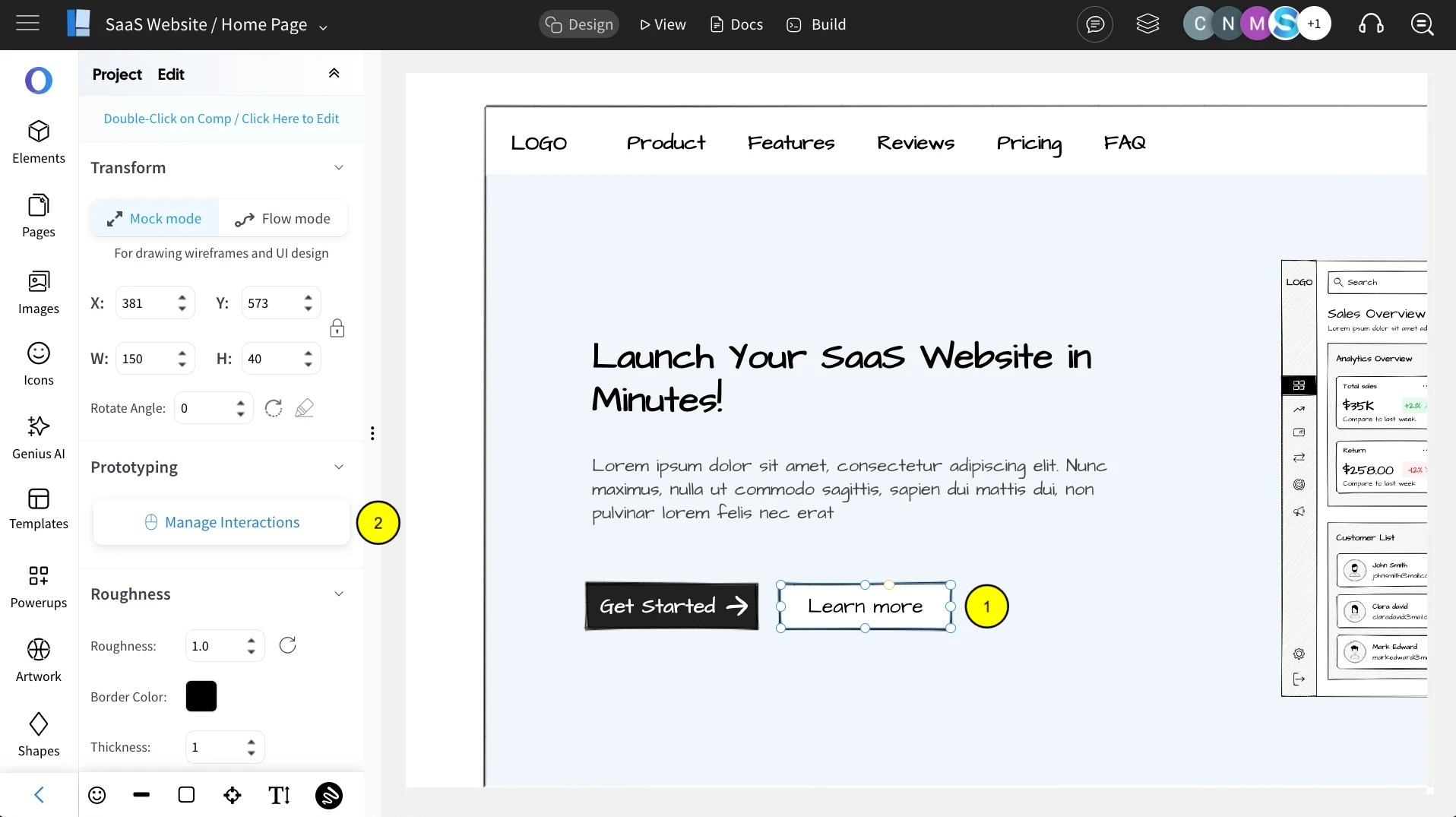
1Select the component to which you wish to add an interaction, and click 'Manage Interactions.'

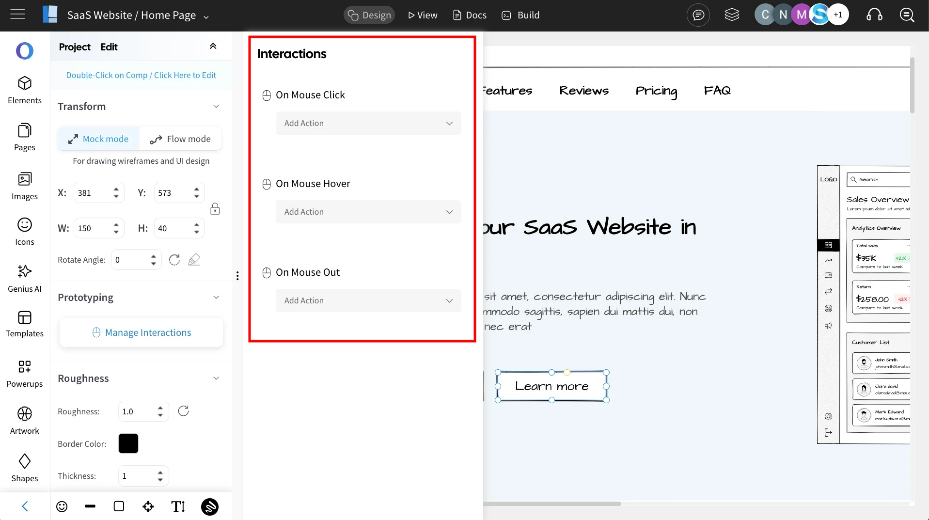
2In the sidebar that appears, you'll find three types of interactions to choose from.

On Mouse Click: As the name suggests, an action occurs when the component is clicked. Example use cases are page navigation from top menu, showing an overlay modal etc.,
On Mouse Hover: Hovering the mouse over the component triggers an interaction. Example use cases are changing button colors on hover or displaying a tooltip on hover.
On Mouse Out: When the mouse moves away from a component, an interaction occurs. This is used in combination with the mouse hover interaction. Example use case can be hiding a tooltip when the mouse moves away from the component.
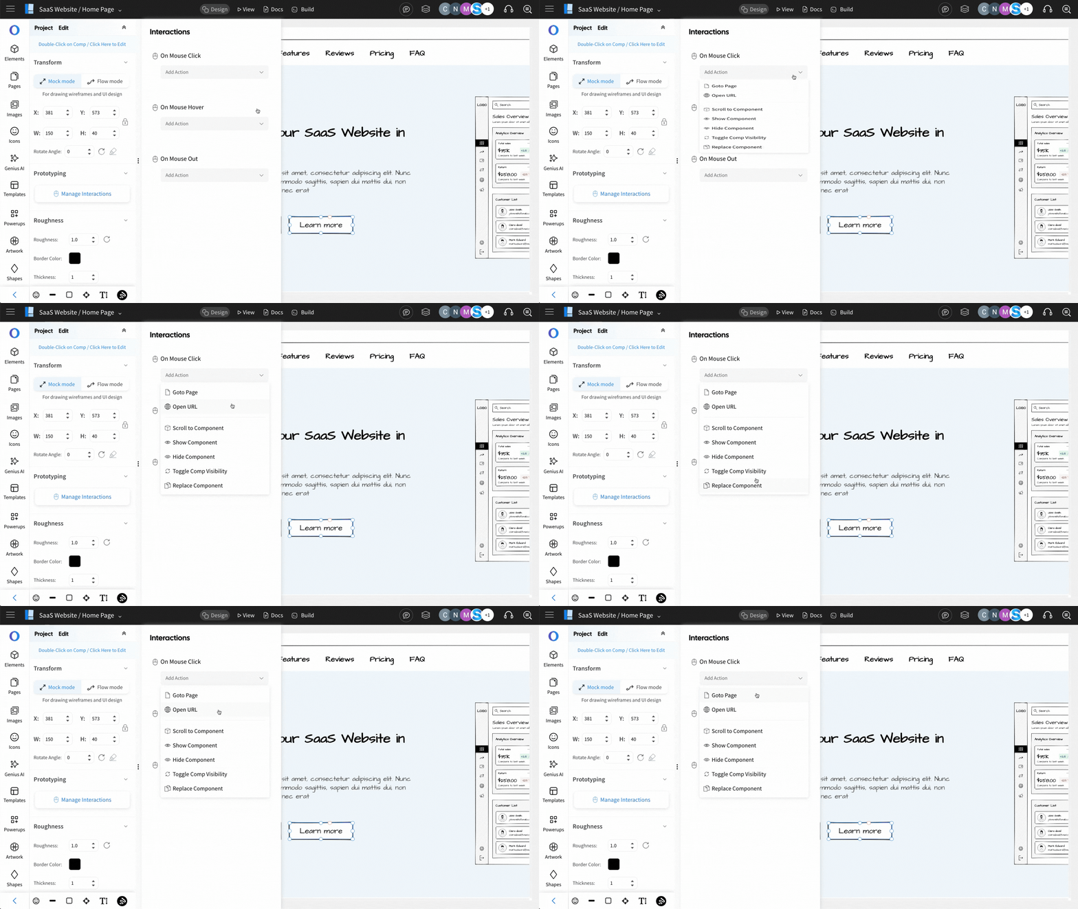
3 The available interaction options are listed on clicking the dropdown below the interaction.

- Goto Page - Use this action to achieve page navigation. Typically used to navigate between different pages of a website or different screens of a web app/mobile app wireframed in different pages.
- Open URL - As the name indicates, this action is to open a public url.
- Scroll to component - Use this action to navigate to a different section within the wireframe page. Example use case can be scrolling to a different section within a single page website.
- Show Component - Use this action to show a component that is hidden using the layers panel. Example use case can be showing a dialog box on clicking a button.
- Hide component - Use this action to hide a visible component. Example use case can be to close a dialog/ modal pop up on clicking the close icon.
- Toggle comp visibility - This action toggles the visibility state of the selected component, i.e., a hidden component becomes visible or a visible component get hidden. Example use case can be a date picker interaction.
- Replace component - This action, as the name suggests, replaces a selected component with another component. This can be very useful to create user flows without recreating entire screens repeatedly or in simple direct use cases such as an image slider navigation.